 |
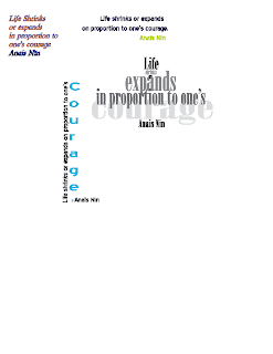
| I had a TON of diffuclty with the inside image, I could have made it better but I just ran out of time. The alignment on the letters is also really bad bc they just wouldn't rotate right. |
Search This Blog
Popular Posts
-
At first I had trouble with finding all the tools I would need to make this sign. After I found everything I needed I had trouble under...
-
I also like insects so i picked this image. Dragon fly's are one of my favorite insects. They are so fast and dominate the sky in th...
-
I had a lot of difficulty picking a picture I wanted to do so i just picked the joker picture. I put glyphs closer together to make a more...
-
I had a TON of diffuclty with the inside image, I could have made it better but I just ran out of time. The alignment on the letters is al...
-
Hi, I'm Brady Eberle and I go to school at A&M Consolidated High School. I like learning about weather and insects. I like to run, b...
Friday, September 30, 2011
Trace assignment
Tuesday, September 27, 2011
Las vegas sign
Thursday, September 22, 2011
Quote revisited
Tuesday, September 20, 2011
Glyph Monster
Thursday, September 15, 2011
Thursday, September 8, 2011
Wednesday, September 7, 2011
Friday, September 2, 2011
Subscribe to:
Comments (Atom)


