Search This Blog
Popular Posts
-
At first I had trouble with finding all the tools I would need to make this sign. After I found everything I needed I had trouble under...
-
I also like insects so i picked this image. Dragon fly's are one of my favorite insects. They are so fast and dominate the sky in th...
-
I had a lot of difficulty picking a picture I wanted to do so i just picked the joker picture. I put glyphs closer together to make a more...
-
I had a TON of diffuclty with the inside image, I could have made it better but I just ran out of time. The alignment on the letters is al...
-
Hi, I'm Brady Eberle and I go to school at A&M Consolidated High School. I like learning about weather and insects. I like to run, b...
Monday, December 19, 2011
Wednesday, December 14, 2011
Wednesday, December 7, 2011
Thursday, December 1, 2011
Wednesday, November 30, 2011
Tuesday, November 22, 2011
Thursday, November 17, 2011
Wednesday, November 16, 2011
Friday, November 4, 2011
Wednesday, November 2, 2011
Friday, October 28, 2011
Thursday, October 27, 2011
Monday, October 17, 2011
Personal Expression Project
Friday, October 7, 2011
Thursday, October 6, 2011
Friday, September 30, 2011
Trace assignment
Tuesday, September 27, 2011
Las vegas sign
Thursday, September 22, 2011
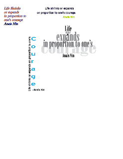
Quote revisited
Tuesday, September 20, 2011
Glyph Monster
Thursday, September 15, 2011
Thursday, September 8, 2011
Wednesday, September 7, 2011
Friday, September 2, 2011
Wednesday, August 24, 2011
10/3
I also like insects so i picked this image. Dragon fly's are one of my favorite insects. They are so fast and dominate the sky in the insect world.
|
 |
I picked this picture because I think Hurricanes are cool. Although deadly they are still very cool. I like how they hav the spiral and then the eye at the middle of the storm.
|
I picked this image becuase it almost looks like it's out of a sci-fi movie. But this is real, their was a thunderstorm when this was taken I guess. This is a picture of lightning in volcanic ashes.
|
I also like space picture's; and also black holes. Black holes are very interseting becuase they just eat everything in their path and all the stuff just disappears. This picture is interseting becuase it shows a black hole slowly eating up a star.
|
 |
I picked this picture becuase it shows a bald eagle catching a fish. Which I have never actualy seen one like this. It is very cool seeing how the eagle just grasps the fish and fly's away.
|
%5B5%5D.jpg) |
I think lightning is one of the most interseting things about weather. Like when it strikes a tree the tree explodes. Lightning also leaves behind lightning "roots" in the ground from where it struck.
|
This is a very pretty pink for lightning. I like how the clouds are pretty much out of the way. You can fully see the lightning strike the ground.
|
I picked this picture becuase its kinda strange. There is a raging storm and then a small rainbow just next to it. Just goes to show rainbows aren't always nice.
|
| I like the colors in this sunset. You almost don't even notice the waves crashing on the shore. Your eyes are just focused on the clouds and the color. |
- Balanced -- This picture isn't very busy.
- Point -- You focus on the clouds first and then to the sun and then to the crashing wave.
 |
I like this picture becuase it's a really pretty thunderstorm. I like weather and thunderstorms. This looks like it was very dangerous though.
|
Bio
Hi, I'm Brady Eberle and I go to school at A&M Consolidated High School. I like learning about weather and insects. I like to run, bike and hike. I have 1 bird, 1 cat, 3 dogs and a hedgehog.
Subscribe to:
Comments (Atom)


